OVERVIEW
BCG is a business built on insight, so the way information is communicated has a direct impact on how ideas are understood.
Across BCG's reports, digital publications and editorial channels, data visualizations had evolved inconsistently over time. Different teams were solving similar communication problems in different ways, creating a fragmented experience for readers and unnecessary complexity for the people producing the work.
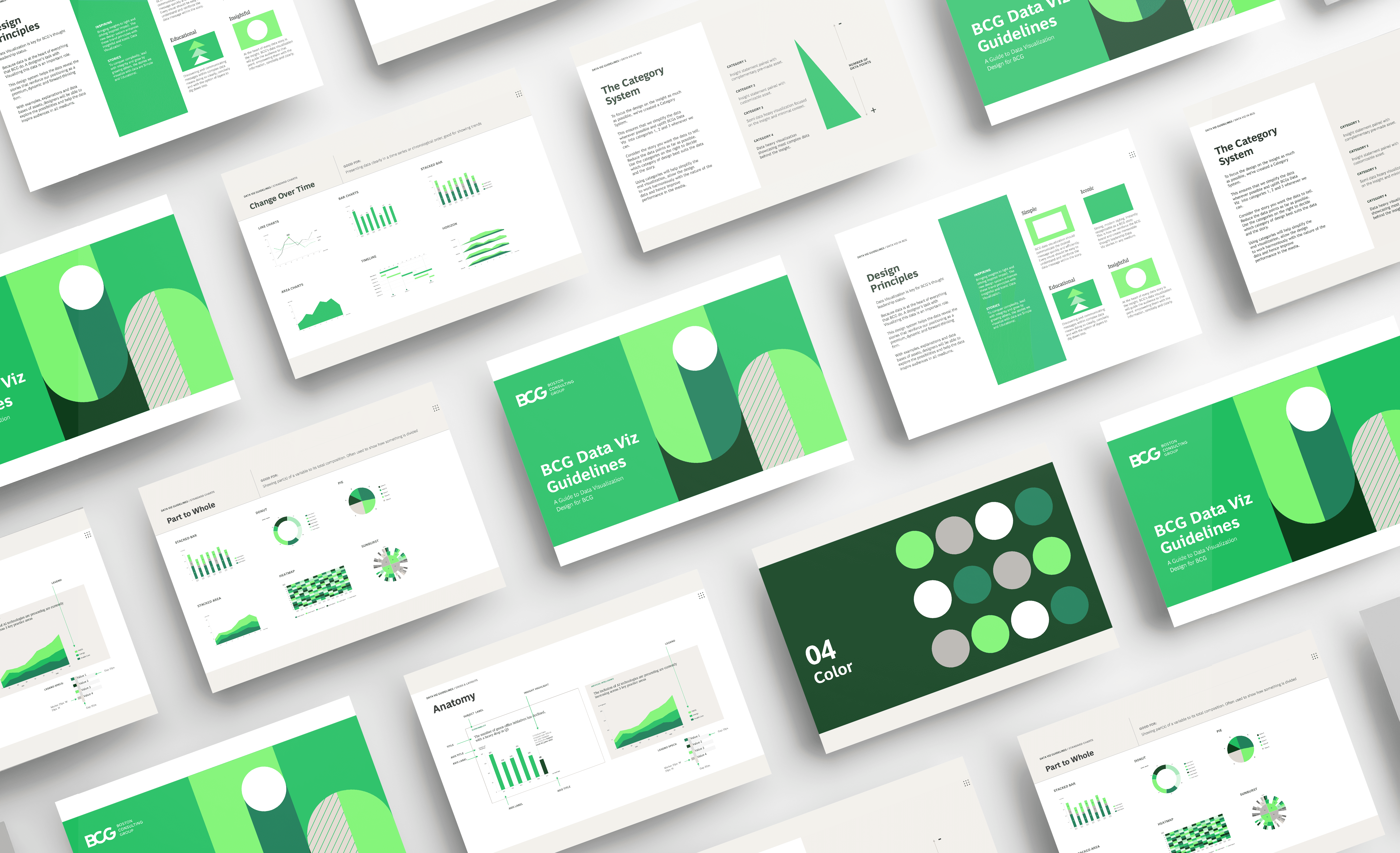
The brief was to create a global data visualization system that could bring clarity, consistency and editorial quality to the way BCG presented data across channels.
The goal was not simply to improve charts. It was to create a shared language for turning complex information into clearer communication.


CHALLENGE
Most data visualization projects are treated as styling exercises. This one needed to go deeper.
BCG produced a large volume of charts and figures across markets, industries and formats. The system needed to work for digital articles, reports, social assets and presentations, while being practical enough for designers, consultants and vendors to use consistently.
The challenge was finding the right balance between clarity and flexibility. Too much freedom would keep producing inconsistent work. Too much control would make the system difficult to apply across the variety of topics BCG covers.
We needed to standardize the thinking behind the charts, not just the charts themselves.


APPROACH
The project began with research.
I led an extensive discovery phase that included an internal and external audit, competitor analysis and interviews with more than eighteen stakeholders across the firm, including Managing Directors, Partners, designers and external production teams.
The research showed that many of the problems were not purely visual. They came from inconsistent decision-making around what each chart was meant to communicate.
That insight shaped the concept I proposed: a narrative-first visualization system. Instead of organizing charts only by type, the framework grouped them by the kind of story they needed to tell - comparison, change, relationship, distribution or composition.
This shifted the question from "Which chart should I use?" to "What am I trying to explain?"
After my concept was selected, I led the development of the guidelines, starter kit and reusable templates. I also helped sell a twelve-month roadmap to keep the work resourced, presented at executive steering committees and coordinated the collaboration between BCG, Rare Volume and Design Studios.

IMPACT
The system created a more consistent and practical approach to data visualization across BCG's editorial ecosystem.
It gave global teams a clearer framework for presenting complex information and helped raise the quality of data-led storytelling across reports, digital publications and other communication channels. It was also used to build charts for a live, published BCG.com editorial piece.
BCG's Global Branding & Communities Director credited the discovery phase and strategic decisions I led as central to shaping the work.
More broadly, the project strengthened the role of design within BCG's thought leadership. It showed that data visualization is not decoration or production polish. Done well, it helps a business communicate its thinking with more clarity, authority and impact.